ChallengesCreating a design system that adapts easily to React and uses
variables from Tailwind CSS while maintaining UI and accessibility
best practices
My rolesDesigner team of one
Team compositionMe
Project durations1 month(Current)
This project is based on the book "Refactoring UI" and uses its
template as the starting point of the project.
A living and customized document created to accelerate the
consultancy process. The Design system enables my work and from
other designers within my company to customize existing components
when starting a new project, while making sure that they apply
design bests practices and components that can be easily translated
to code using React MUI and Tailwind CSS.
The problem
In projects I led, I always work side-by-side with developers,
resulting in a efficient handoff and a consistent coded design
between Figma and the actual delivery.
That reality wasn't the same reality in other Junior teams, where
their face 3 main problems:
Time spent coding new components, bad-use of design best
practices/accessibility, coded design inconsistency.
In a agency fast-paced enviroment I value speed of delivey and
iteration. The Laje Project speed up the start of a new projects
in design and the implementation of development.
Design already would start with all custom components, where they
can adapt for project branding color, fonts, and tone of voice.
Already contemplating Figma logics for different devices and
light/dark mode.
For development speed meant implementation and consistency. How
fast they can adapt their library to look like the design so QA
doesn't create a layout card.
Considering that I created based on React MUI library and used
Tailwind properties all accross the project, enhancing the coding
experience and the quality of delivery.
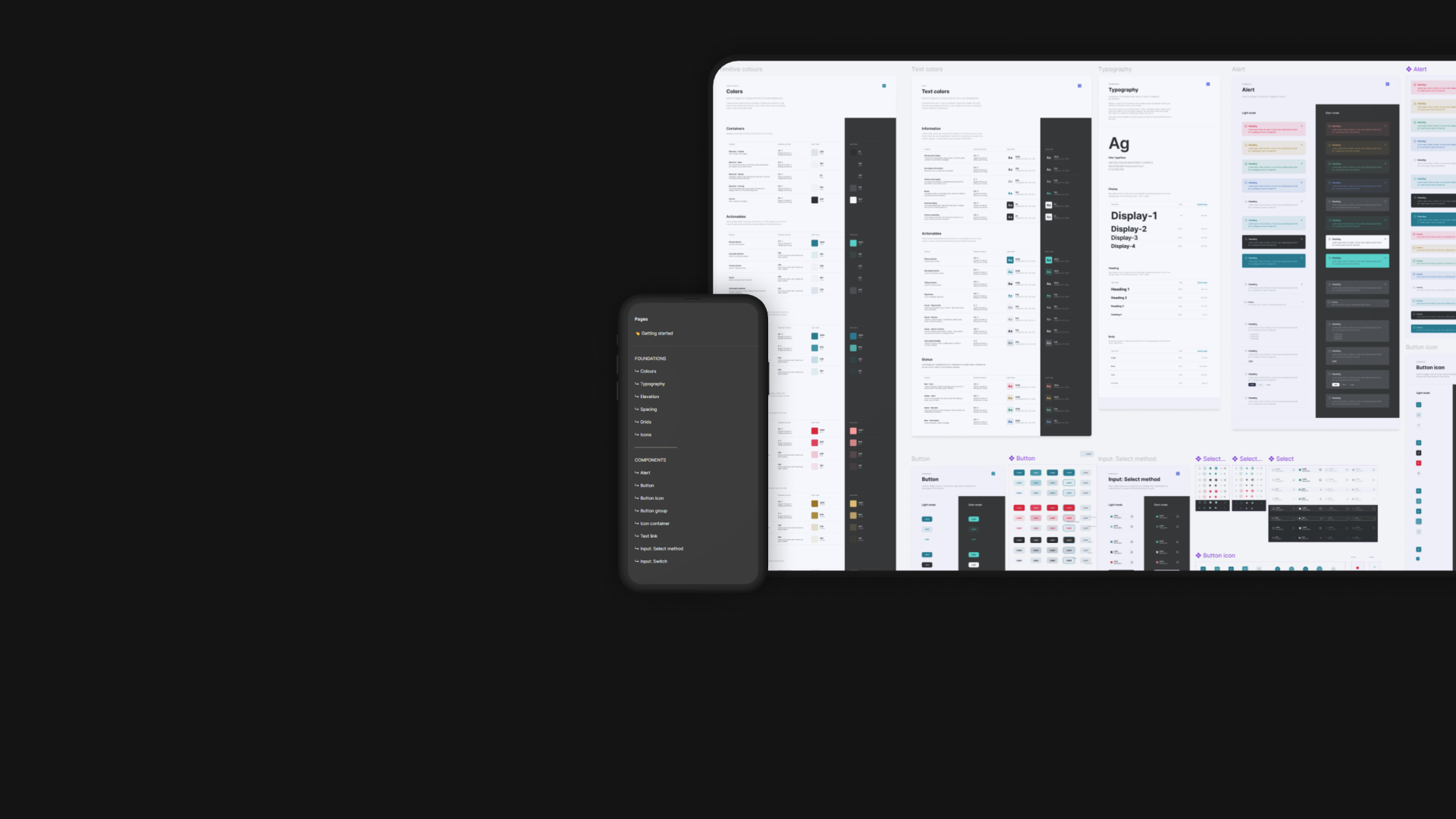
Foundations
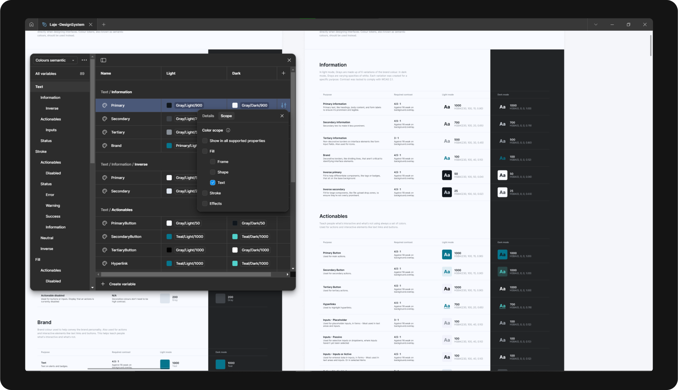
For foundations, colors was one of the main subjects - I set the
goal of all projects in the company reach a minimum of AA WCAG 2.1
Standards, with that said I ensured that most colors reached 4.5:1
constrast and a minimum of 3:1.
The colors where all set as variable in Figma and organized in a
primitive colors folder, where changes reflected in other two
folders, branding and semantic colors - where they were organized
by elements.
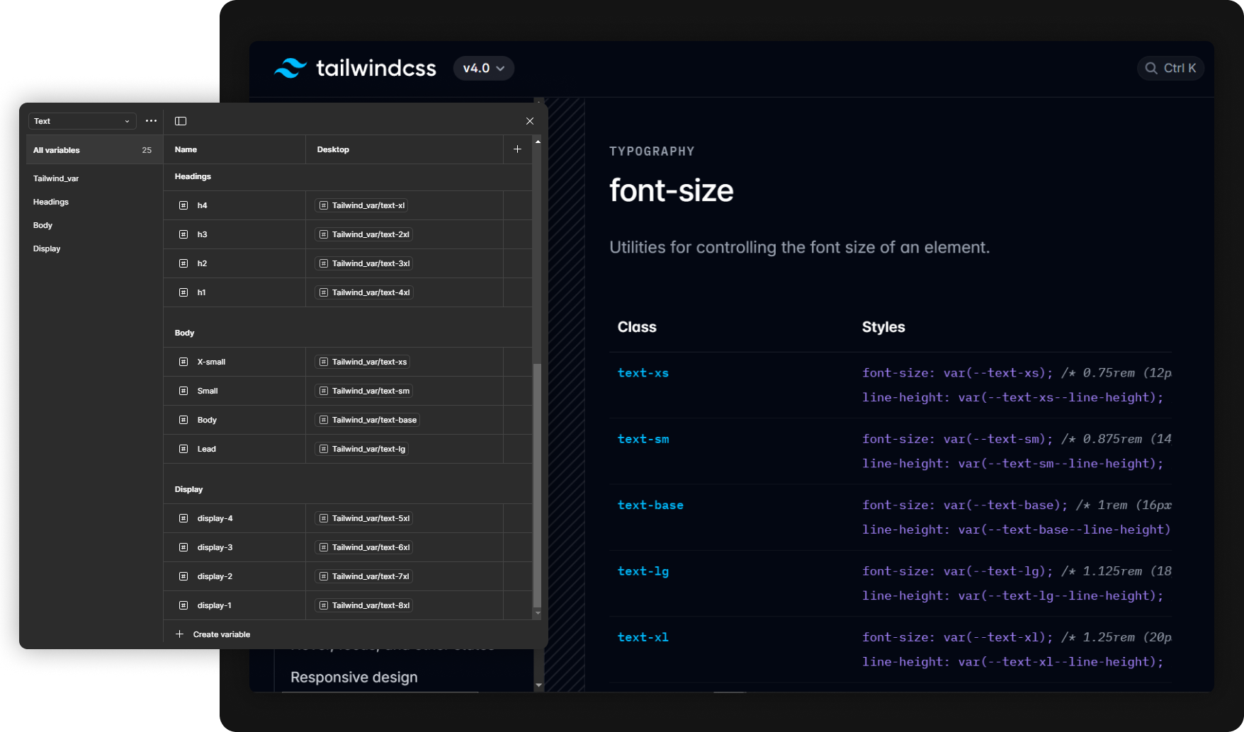
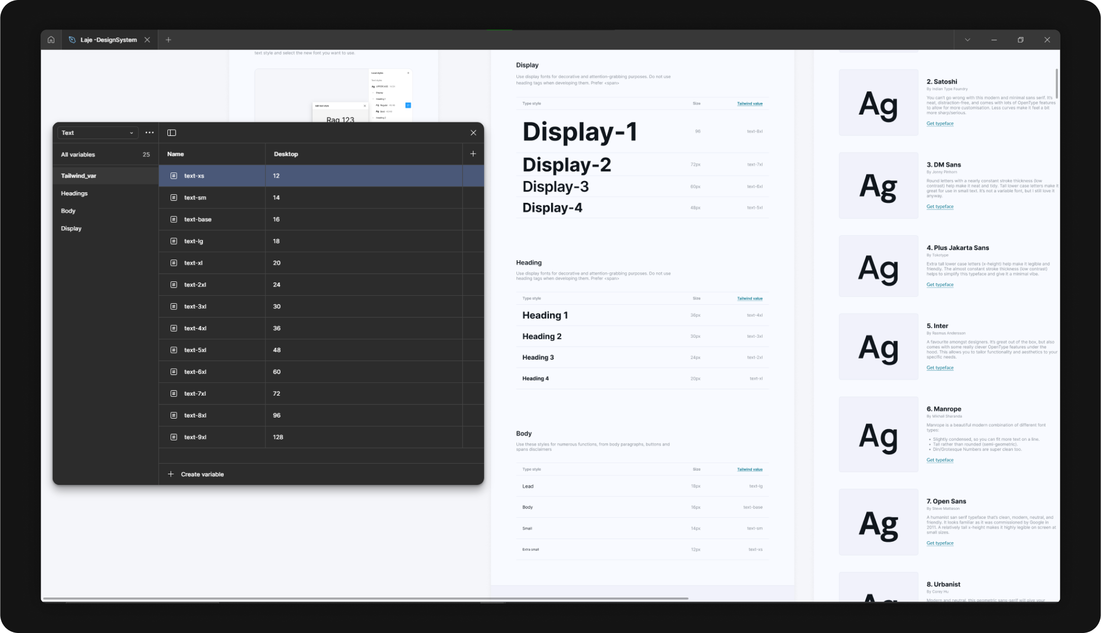
The same treatement was done in terms of typography, and as
mentioned Tailwind CSS properties were applied for sizes of text -
as for other things like spacing, corners...
I kept suggestions from the book refactoring UI along the design
system, such as suggestions of fonts and step by step for making
changes on the variables.
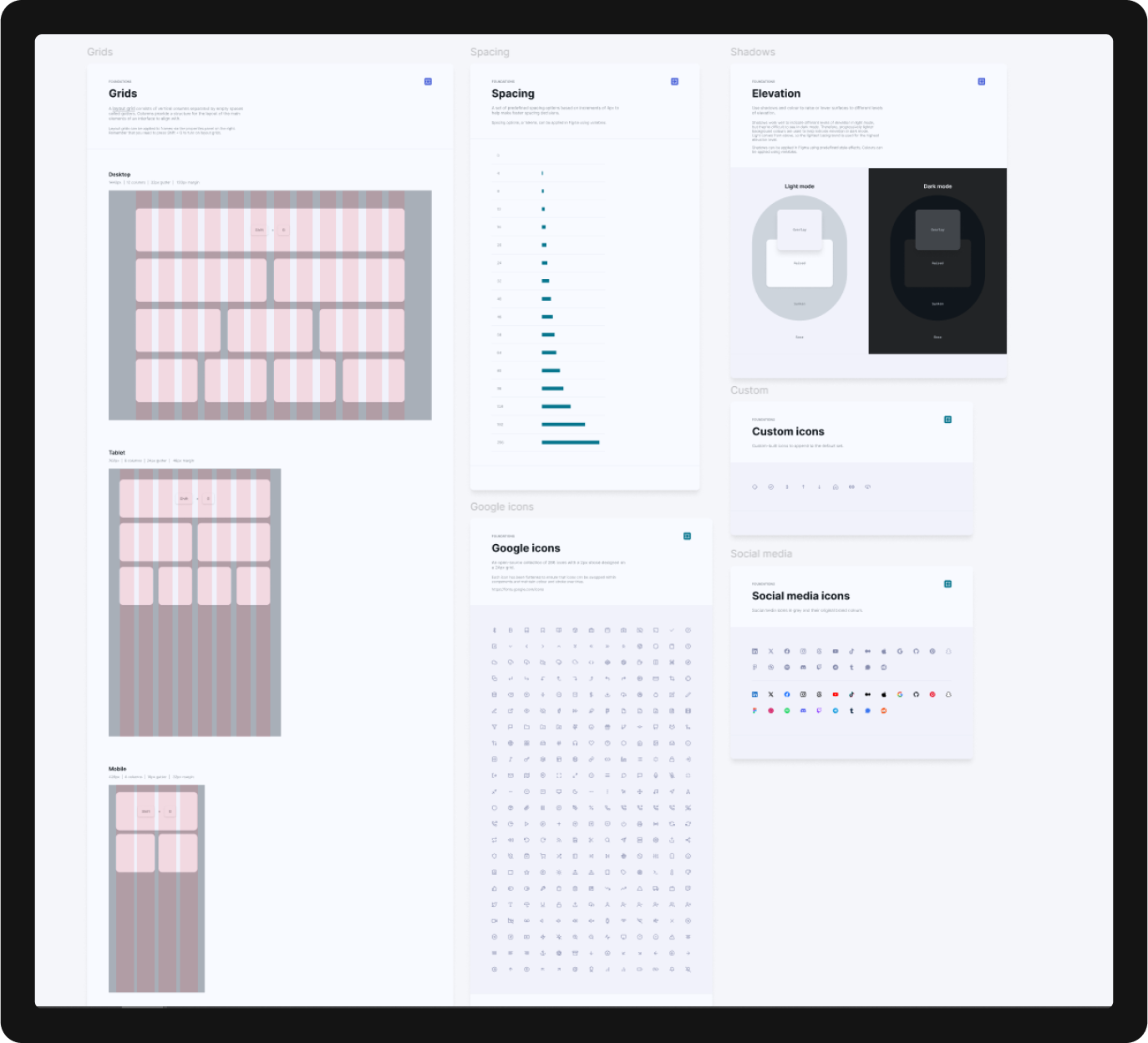
Other foundational items were configured for a faster implementation and better implementation, such as Icons (using Google font icons), elevation, grids and spacing guideline.
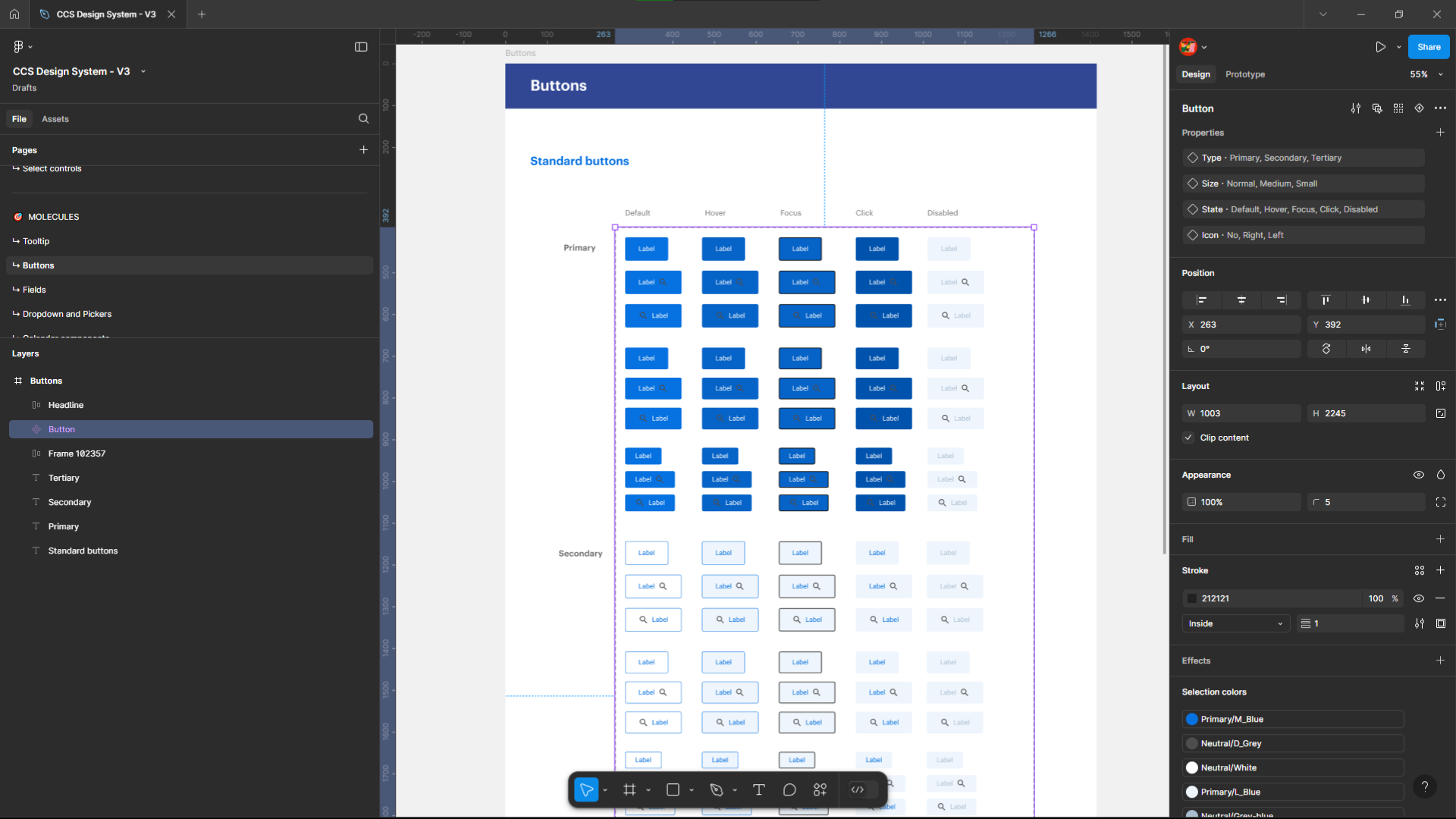
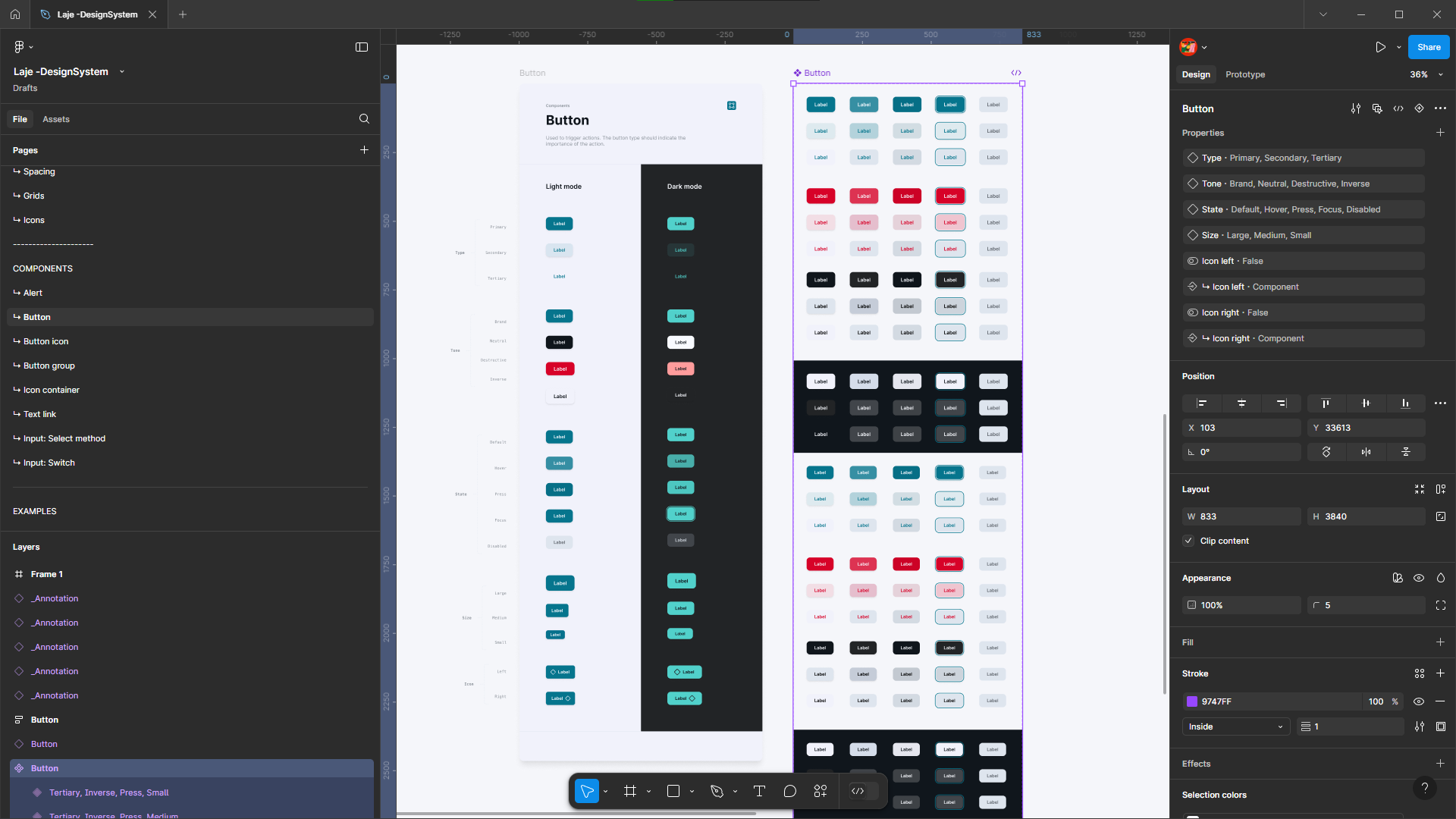
Components
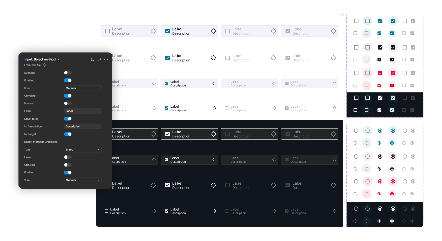
Actionable components were configured to have 3 visual hierarchy levels: Primary, Secondary and Tertiary - And if needed status color coded.
They were also divided in tables to display their behavior and interaction states, responsiveness and possible modifications.
Instance swap, boolean, state dropdown and many other logical inputs were inserted in Figma components to make them as flexible as possible without losing the principles.
Implementation
This project is currently in progress, started in end of January 2025. It now has been used in two different project - They both reached +95 accessibility score in Google lighthouse and high component reusability, across the platform and with the Design System.
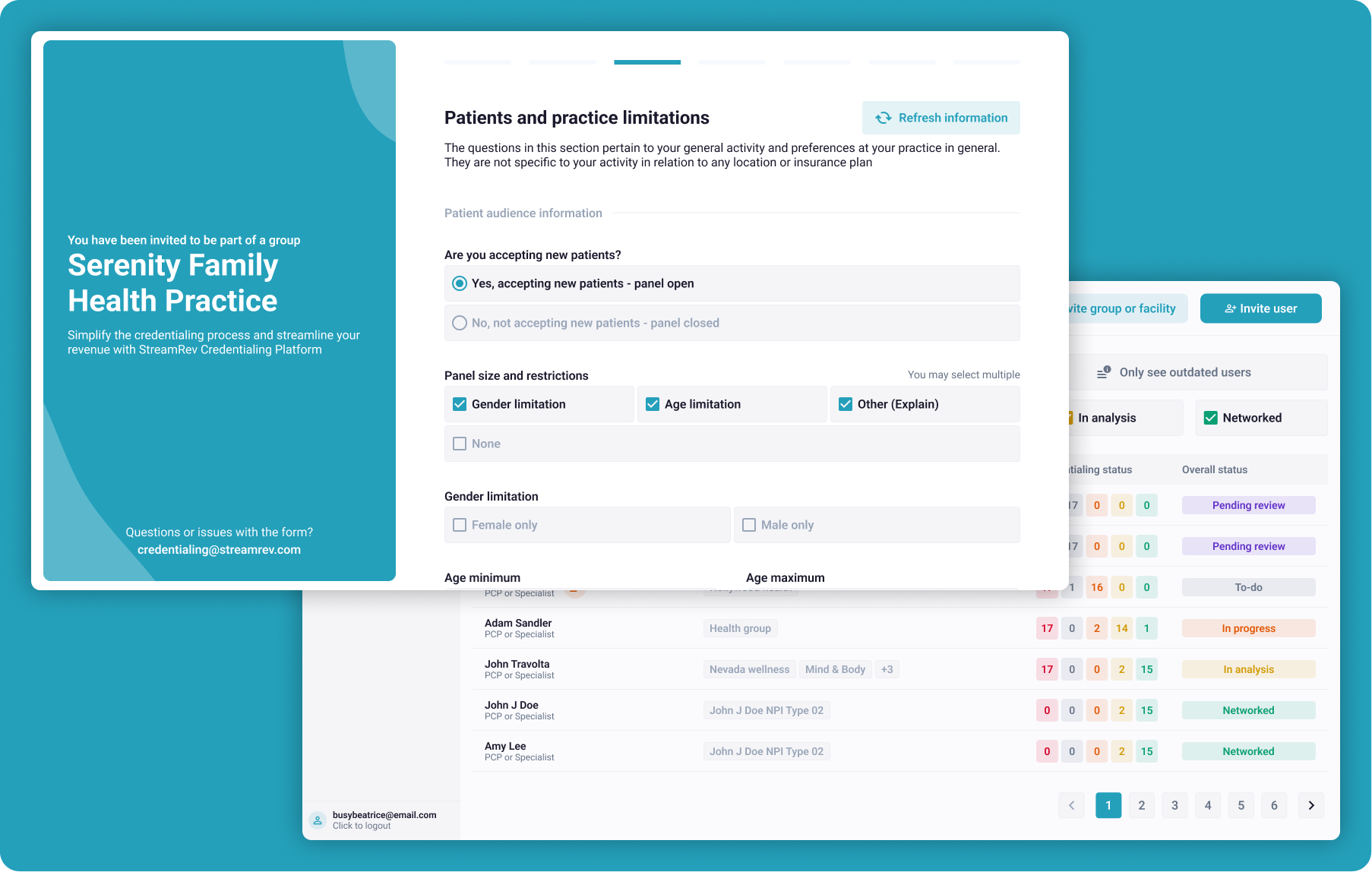
The first project was StreamRev - where the design system proved to be high adaptable for multiple colors statusses that we needed to display in the system.
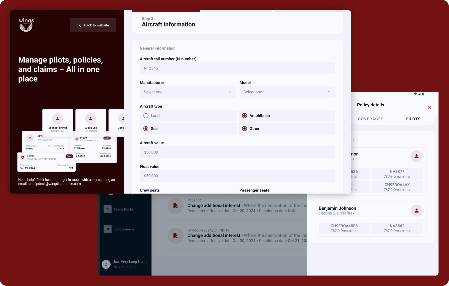
The second project was Wings Insurance, you can see that the onboarding format that worked in StreamRev also worked in the complexity of the aviation industry.
That enabled my product and development team to speed up the prototype and iterate faster, reaching a faster delivery for Wings.